
Logo Design To Perfection: A Case Study Of TaskCloud Brand Transformation
We transformed a growing SaaS startup’s brand identity through strategic logo design, helping them build trust, improve conversions, and stand out in a competitive US market.
Let’s explore how a professional logo redesign created measurable business impact.
The Client – A Growing US SaaS Brand
The client is a fast-growing USA-based Saas startup that seeks to gain a strong brand in the competitive market. Their services were high-quality and well-positioned, but their branding was not as professional.
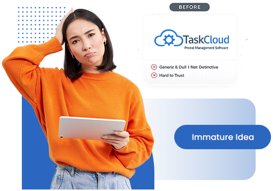
Their current logo was generic, not unique, and failed to convey the values of the brand. Consequently, the business was not able to establish trust, recognition, and a good first impression with potential customers.
In the modern competitive digital environment, visual identity is an important aspect of brand perception, and the design of a logo is a key element of successful performance in the long-term.
Defining the Core Identity Gap
As soon as the client presented himself to us, it was obvious that the major problem was not actually design per se, but perception. The logo did not distinguish the brand among the competitors and was not as strong visually as it should have been to create credibility.
The dilemma here was to make a dim and immature idea into a strong brand symbol that embodies professionalism, trust, and scalability. Also, the client needed several variations of the logo to be used on various platforms, such as websites, social media, and marketing materials.
Finding a balance between creativity and simplicity without losing industry relevance was among the most important facets of this project.
Logo Design Objectives
We have been assigned the role of designing a modern, clean and versatile logo that fits into the position of the brand. The design had to be flexible both in the digital and print versions and needed to be clear and consistent.
The most important criteria were the creation of a distinctive visual identity, its scalability to other applications, and a minimal but effective design solution. The logo should also have stood out in the competitive USA market in line with the current design standards.
Our Step-by-Step Approach & Solution
In order to deliver a combination of creativity and ROI, we took a more strategy-driven route instead of immediately diving into the design phase.
This way, all stages were consistent with our client’s vision of developing an identity that is reliable, scalable, and high-performing.
Preliminary Research and Planning
Our process started with thorough research of the current market environment of SaaS solutions in the USA, specifically focusing on the Human Resource technology segment, where we could analyze competitors such as Gusto, Rippling, and BambooHR. This helped identify trends in terms of design elements, colour theory, typography, and other design components but also highlighted a crucial weakness – lack of human-centeredness among all those brands.
From Concept to Refinement
Beginning with research-based ideas, such as corporate minimalism to technology-oriented designs, we tried out various paths that found a middle ground between strategy and practical functionality. After selecting a course of action, we narrowed down the typography and color scheme, incorporating professional blues and expansionist greens. The end product is a minimal, humanistic icon and a contemporary sans-serif identity that can be optimally scaled across the website and SaaS platform of the client.
Finalization and Delivery
The last phase was a complete logo system with several variations to be used on the web, mobile devices, marketing etc. and light and dark so that it can be used anywhere. This guaranteed uniformity of brand delivery in every touchpoint, including SaaS dashboard and ad creatives and presentations, and formed a unified and scalable visual identity that was ready to expand.

Results & Impact
The project was completed successfully with a strategic approach and a perfect execution that provided the client with a powerful and professional brand identity that perfectly matched the business objectives of the client. The transformation allowed the client to sell his/her SaaS platform with more confidence and credibility, particularly to the US market, where initial impressions directly affect conversions in a competitive market.
The client has noticed a visible effect in the perception of their brand, both aesthetically and functionality, which resulted in better interaction and user confidence on all digital platforms. Some of the main results following the transformation were:
- Increase in the conversion rate and the demo bookings through a better first impression.
- Lower bounce rate since the platform became more credible and professional to the users.
- Higher brand recognition, where the company is more well-known in a saturated SaaS market.
- Improved results of marketing campaigns, such as improved CTR in Meta and Google Ads.
- Unified brand experience on site, product interface, and marketing content.
Key Takeaways & Insights — Building A Scalable SaaS Brand Identity
Trust and conversions are motivated by a solid brand identity. This project proves that strategic design isn’t just a visual upgrade—it’s a powerful engine for business growth.
Following the rebranding, the client had a realization of the importance of the first impressions in SaaS. An elegant, neat logo also creates a sense of credibility and makes users want to learn more about the platform.
The general myth is that a logo design is all about the beauty. In practice, a properly organized visual identity will assist in increasing the conversion rates, decreasing the bouncing rates, and overall improving the marketing performance.

Staying the same in terms of identity on the web, product UI, and marketing medium served the purpose of enabling the client to build a cohesive brand image that enhanced recognition and made them a trusted SaaS firm within the market.
Client Testimonial
“Before the rebranding, we underestimated how much our visual identity was affecting user perception. Even though our product was strong, the brand didn’t reflect the same level of quality. After the logo transformation, the difference was immediate — our platform started looking more professional, trustworthy, and aligned with what US customers expect from a SaaS company.
We saw a clear improvement in user engagement and demo bookings within weeks. The new identity not only helped us stand out but also gave us the confidence to scale our marketing efforts. It truly felt like we moved from being just another startup to a serious SaaS brand.”

Conclusion & Future Outlook
This project brings out the importance of an excellent logo in changing a brand identity and market positioning. Concentrating on strategy, design accuracy, and consistency, we managed to provide a solution that not only satisfied the client’s expectations but also surpassed them.
Good visual identity is the key to a good brand, and the case study shows that it is worth investing in professional logo design services in the long run.