

It is not hard to come across the plethora of red logos in our day-to-day hustle and bustle of life. The most popular video streaming platform and application, YouTube, is in red—totally free to use. Next, Netflix, the most famous paid entertainment OTT platform, full of exciting content, is also in red.
Have you ever thought about why big brands gravitate towards this color and what other top brands have chosen red to be the identity of their logos? If yes, continue reading for a simple, easy, and yet in-depth introductory analysis below.
Why Most Brands Opt for Red Logos!
The main reason behind choosing red logos is their pragmatic value. Brands select the color red to make their logos vibrant because it suits their situations or contexts well. For example, a fashion clothing brand that offers trendy garments might choose red to express the urgency inherent in the industry!
Furthermore, red can also be used in the automobile industry, as it expresses heat, energy, speed, and performance. So, red expresses various ideas and emotions, and thus creators worldwide have always taken advantage of it. And, by the way, red is also popular because it looks stunning in all types of printing.
Read more: The Standard Photo Size And When You Should Break From It
What is the Psychology of Red Logos?
Psychologically, the color red is strongly associated with a range of human emotions, such as love, passion, anger, power, confidence, alertness, intimacy, and hunger. Furthermore, this color is also a decisive advocate of excitement and energy, best for brands targeting teenagers and young adults.
In short, the following are the mental evocations often connected with the red color.
- Conveys danger and warning
- Stimulates excitement and energy
- Represents aggression (best suited for high-performance vehicle branding)
- Showcases dominance
- Symbolizes passion and desire
- Associated with power and wealth
Note: Along with all that, red is super catchy and attractive. If there is red, you want to look at it for its dynamism. Thus, it becomes the first choice among famous red logos, as discussed below.
Read more: Basic Photo Editing Manual: 10 Techniques, 4 Tools, and 5 Tips Explained
Top 20 Red Logos with High Performance and Maximum Impact
20 of the most stunning and effective red logos are discussed in the sections below. In short, we have included the following brands in this listicle.
- Coca-Cola
- Netflix
- Target
- Levi’s
- Canon
- H&M
- Nintendo
- Budweiser
- YouTube
- ESPN
- Suzuki
- Swiss International Air Lines
- Verizon
- Toyota
- Marlboro
- Frito-Lay
- HSBC
- Colgate
- Lego
- Ace Hardware
Consider the following elaboration for more.
1. Coca-Cola

That is the place where the red as logo seems totally justifiable. Coca-Cola is a world-renowned brand that is typically known for its stunning ability to soothe a thirsty throat under the scorching sun! The red in the logo and the drink both complement each other very well.
2. Netflix
Not just for its super engaging content, the completely red logo of Netflix also makes the platform unique and authoritative. Its subscribers see the sound and visuals of the logo as an indication of entertainment as exciting and full of suspense as the color red itself.
3. Target
If you want to consider the example of red and white logos that are simple yet elegant, you cannot walk past Target. Nothing can be made simpler than that while keeping the key idea behind the brand readily available to the audience.
Do you know? The target here is to allow buyers to expect more by paying less! It is one of the most simple and effective types of logos.
4. Levi’s
Levi’s is also a red logo that has grabbed the attention of buyers for many years now. To be precise, it is a design featuring the perfect combination of white and red. The white brand name in the center of the red background provides an inclusive approach! For example, this particular arrangement shifts the entire focus to the word “Levi’s.”
5. Canon
Canon is the best instance of the red oblong logo, having similarities with Levi’s. It also has white as the font color and red in the background in one of the logo’s variants. Its rectangular shape is simple and impactful, boasting precision and brevity at the same time.
6. H&M
H&M is for all the individuals who live, breathe, and eat fashion. The logo of the brand comes in a completely red. One of the most influential wordmarks or red logos. Its rich and vibrant color speaks to the urgency of the fashion world—trends to be caught on time for fresh looks and maximum appeal.
7. Nintendo
Helping people connect and play together for many years, Nintendo, among red logos, is another name on our list. Red seems best here to represent the early excitement and craze associated with ever-innovative gaming devices.
Fun fact: If you don’t know that, this is for you! Mario was first created by Shigeru Miyamoto for Nintendo.
8. Budweiser
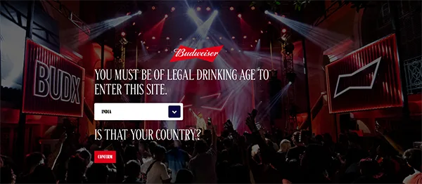
Nothing could be more fun than red when it comes to a drinking product. Budweiser is a brand of alcoholic beer. That is why choosing red in the logo is a smart move because the product line is particularly meant for adult use. You cannot even enter the official website if you haven’t crossed the legal drinking age yet. Well, honestly, being an adult is really different shades of red! And thus the red in the logo here rightly expresses full boldness and confidence.
Note: A great logo is always created in compliance with brand guidelines. So, it is always excellent at achieving its targets and incorporates all the key essentials required for effective branding!
9. YouTube
One of the most famous red logos among us is YouTube. It is so simple and to the point that you just need to look at it to learn about its rightful intention on the spot. The smoothly cornered rectangular background in red gives all the meaning to the white triangle in the center, meant for effortless streaming.
10. ESPN
ESPN targets marketing with a well-connected and modernistic red a logo. It is not just red, but unique, minimalistic, and quick. Its smooth appearance and the striking line of erasure at the top make all the difference. In its build, it also features swiftness and energy implicitly.
11. Suzuki
Every fan of automobiles and even a normal person knows about Suzuki. That is the brand value this company has created throughout the years with quality products and effective marketing, with a red logo in a stunning S. Its tremendous popularity is one of the reasons we have included it here.
12. Swiss International Air Lines
Look at the Swiss International Air Lines logo, and you have found another one of the red logos here. It is inspired by the national flag and speaks to simplicity and quality! The strategy of logo creation here is mindful and effective, as the design is easily recognisable against the white body of the aircraft.
13. Verizon
Another name in the red white a logo category is Verizon! It is ultra simple, just laying down the exact name of the company in bright red for easy branding, a wordmark! There is also a nuance attached to it—a noticeable gradient effect on the V at the beginning. On careful examination, it creates the scene of a rising sun on the infinite horizon.
14. Toyota
If you look at the logo of Toyota, you will find nothing more than a careful and strategic arrangement of three ovals. That looks not just simple but elegant as well. It showcases energy and performance, where red intensifies the sentiment perfectly.
15. Marlboro
Marlboro is one of those red logos that offer striking memorability with the perfect color combination. The name of the brand in black with a simple and edgy red crown overhead makes an impressive picture for a cigarette product. This red crown mimics the opening head of the cigarette packet, an ingenious concept to propagate the brand image!
16. Frito-Lay
For a snack brand, nothing is more exciting than the combination of bright yellow like lemon and bright red like chillies. Frito-Lay implements this strategy and gives the world the most red quote logo. How a red ribbon holds the sun-like fresh yellow sphere is out of the box and stunning.
17. HSBC

HSBC stands for The Hongkong and Shanghai Banking Corporation. It is one of the largest banking and financial services groups. That is why its logo seems to be emitting the image of a professional, dressed in red with a large white collar. However, geometrically, that is just the smart play of a hexagon or a bunch of triangles arranged together.
18. Colgate
Another one of the red logos on our list boasts even higher familiarity across the globe. It is Colgate and its bright red and white iconic brand representation. This design, in a red cup-like structure with the name written in white, is simple. But the minimalist smile symbol at the bottom joining ‘o’ and ‘t’ makes all the difference. That is all about the promise of strong, confident, and white teeth.
19. Lego
Sometimes, it is not all about a red and white logo! Instead, all it takes is white, black, a little bit of yellow, and then a considerably large portion of red in a square! Well, that much is justifiable to meet the expectations of kids. Lego offers a very exciting brand representation with this design, and the red background provides depth.
20. Ace Hardware
Finally, we have come to Ace Hardware, which also has a red logo! The design here conceptualizes a large lettermark and a tagline below that seems more like a bold statement. The black and red variation in the tagline proves effective in creating sufficient contrast and distinction!
Read more: Detailed Guide about Poster Sizes: Dimension, Uses, Impact, Benefits and Criteria
Conclusion
These are the most popular red logos from mostly international brands, having worldwide market reach and influence. If you are considering or in the process of formulating a stunning logo for your fresh brand, this guide can be taken as a starting point in your deep research. Always choose red if it suits your situation or business image about 80% to 90%.
FAQs
Q1: Which brand has a red logo?
So many brands, like Coca-Cola, Netflix, Target, Nintendo, YouTube, Levi’s, etc., have red logos.
Q2: What apps have red logos?
Netflix and YouTube are the most popular apps with stunning red logos!
Q3: What are the top 10 most recognizable logos?
The following can form the list of the top 10 most recognizable logos:
- Coca-Cola
- Netflix
- Target
- Levi’s
- Canon
- H&M
- Nintendo
- Budweiser
- YouTube
- ESPN
Sources:
- LogoDesign: 100+ Logo Collection: Red Logos That Make a Bold Statement
- Designevo: Top 25+ Red Logos – Designs, Industries & Branding
- Verywell Mind: Red Color Psychology