

Metropolitan markets and online platforms are full of advertising campaigns of different services and products, but the thing that creates their unique identity is their logo. A logo is a unique mascot that signifies the aims, personality, and authenticity of a business.
So, if you also want to make your business popular among the robust competition in your desired category, you have to explore different types of logos mentioned in this guide, which will help you to create yours, along with common mistakes that you must avoid.
What is a Logo? Why Does it Matter?
A logo is a unique visual design that makes the special identity of any brand in the market using different types of elements, which are truly focused on promoting their vision in front of the masses.
It generally consists of three main elements: a mascot or name, a unique element (Shape or object), and a theme, which consists of color patterns that directly intrigue the minds of general people.
A logo matters in the market the most because it helps brands stand out among the robust competition and allows entrepreneurs to promote awareness of their brands.
What are Different Types of Logos?
Well, the design language of logos is infinite, but most follow seven universal formats that every brand in the market takes inspiration from. Most designers use these formats as an ideal template for experimenting and creating a unique mascot.
1. Lettermarks or Monograms
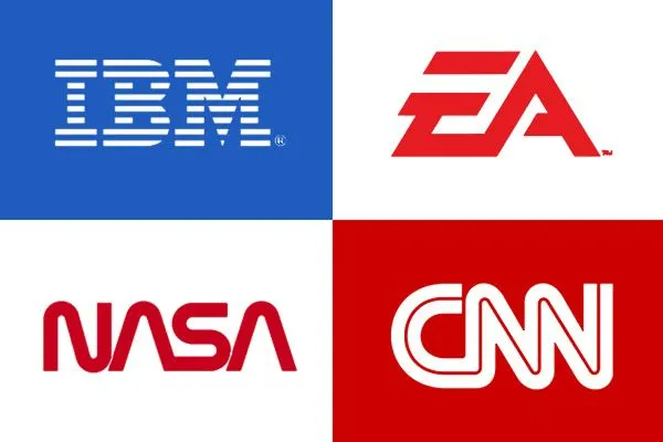
Lettermarks or monograms are one of the most common yet impactful formats of logo because their simplicity fosters an authoritarian impact in consumers’ minds. They are mostly combined with the initials of the brand names to shorten their public name to connect with audiences easily. You might be unaware, but global firms like NASA, IBM, and MARVEL have been carrying lettermark logos for ages.
2. Wordmarks or Logotypes
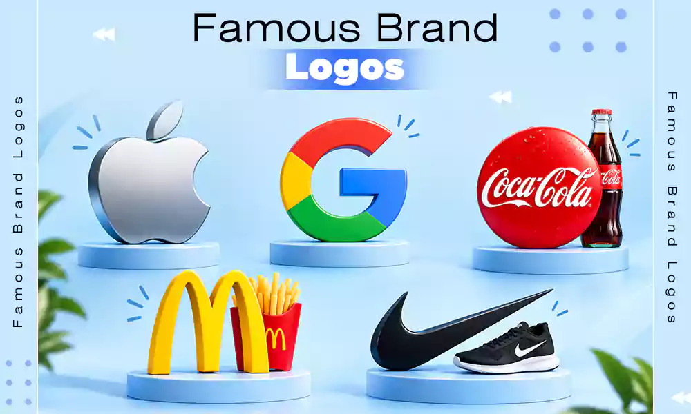
Next up we have wordmarks, which are also called logotypes, because they represent the name of their brands without any ideal message or integration with pure creativity and color palettes. This type of logo is best for brands that have a catchy name and just want to spread awareness of their brand. Google, Coca-Cola, and Yahoo are the most common examples of this template.
3. Logo Symbols or Pictorial Marks
Logo symbols, which are also known as pictorial marks, are basically identity-based elements that have their own meanings that align perfectly with the brand’s persona and foster audience engagement through relatability and affinity.
All the popular pictorial marks like Twitter, Instagram, and Barbie represent their purpose in the market through posters, brochures, and magazines, and who they want to associate with.
4. Abstract Designs
As the names, abstract design logos are based on the patterns or elements that we usually see in our day-to-day lives, which allows us to easily resonate with them and stay in our minds for the longest. They can be in the shape of any bird, fruit, sports equipment, or anything that we cannot overlook.
It has been seen multiple times that they cater to most first impressions for emerging brands and are suited best for both online and offline business models. Apple, Pepsi, Nike, and Spotify are some examples here.
5. Mascot Logos
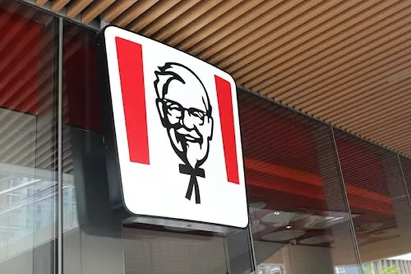
The most fun and creative format of logo designs consists of mascots, which interpret the notion of colorful and wholesome vibes. Mascot logos are generally used by those brands that are focused on a target audience of all age groups.
This format is best for brands that are looking to create a connection with their audience through stories and emotions by integrating them with the social media graphics. The best example of a mascot logo is KFC, where they portrayed the image of Colonel Sanders, who originated the brand and recipe of their signature fried chicken.
6. Hybrid Logo

Hybrid logos are the most unique of their kind, and they are being heavily used in the sector that prioritizes young audiences the most. Basically, it is created when a lettermark or monogram logo is combined with a set of pictorial and abstract marks, making it a perfect blend of both worlds.
It primarily features a mascot, which is integrated with bold text within the framework. Companies like Burger King, Lacoste, and Adidas use the hybrid logo in all their campaigns.
Read more: Types of Printing: Methods, Meaning, and How to Choose the Right One
7. Emblem Logo

Last but not least, we have the emblem logo design format, where they are heavily inspired by gothic seals, stamps, crests, and badges, which makes them feel timeless and enigmatic.
In modern day, they are highly adopted by educational institutions, legacy brands, and companies who want to sell products or services through the authority of power. The best examples in the market of emblem logos are BMW, Lamborghini, Porsche, and many other luxury car brands.
How to Create a Logo? Best Practices For Each Category
Creating a brand design logo is not a complicated job, but it is not easy either. See, logo making is a multi-dimensional process that requires strategic alignment, critical thinking, and a lot of research. That’s why we have an easy breakdown of this procedure that allows you to make a logo for your venture that will be market-friendly in five easy steps.
1. Brainstorming and Analysis
The first thing you have to do before creating any logo for your firm is to analyze the various market trends and brainstorm new ideas according to the values, product perception, and aim of your product or service.
It will help you to make a logo which is audience-centric and defined rather than a generic design that might get ignored easily.
2. Select the Type of Your Logo
Next off, select the type of your logo by understanding your preferences, market fit, and category of your brand.
Understand what your competitors are doing and how their logo is more intriguing than your existing version; after that, consider the type of logo for further development. Also, choosing a logo type beyond the general category can be both a boon and a bane.
3. Choose your Color Palette
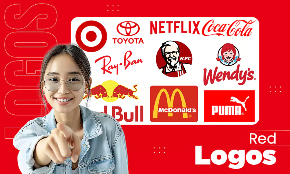
Color theory plays a very vital role in logo creation and even in overall branding of your product or service because it directly interacts with the psychological triggers of the users. Choosing an attractive color makes the job of intriguing the target audience even easier. For example, McDonald’s has a bright red and yellow color palette which makes outlet spotting easy from any corner of the road.
4. Design Prototypes
Before selecting a final design, always make different prototypes in 2-3 logo formats and tweak the attractive color schemes to identify the best pattern that you think is appealing and unique at the same time.
This will make things clearer about the design perception and allow you to select the accurate logo that suits your brand’s ideology.
5. Test and Refine
After you finalize the design of your logo, you must first submit it to a test audience or seek expert recommendations to get insights about design language, color theme advantages, and its potential impact on the market. Doing this will provide some forbidden details and loose ends that will help you to refine your logo design.
Read more: Basic Photo Editing Manual: 10 Techniques, 4 Tools, and 5 Tips Explained
What are Some Common Mistakes to Avoid while Making a Logo?

During this entire time, there are high chances that some mistakes can happen if you are learning the creation process or working with new talents, which is why, to bring complete awareness, we have mentioned frequent beginner error which you should try to avoid at best by not overlooking some important aspects.
- Avoiding proper research and analytics: Not doing appropriate brainstorming can make your logo design bland and generic, as it won’t have that trendy kick in it. High chances are that making an icon without research can make it much more boring and avoidable.
- Overdetailing in design languages: Sometimes adding excessive details, elements, and text can make the logo overstuffed and confusing, which makes it hard to remember. The audience usually ignores such logos because they have so many patterns that their brain usually doesn’t register easily.
- Poor color scheme selection: It can ruin the entire logo creation process and undermine all the effort put in earlier. Your scheme has a vital role in triggering neural responses in your consumer, which is why abrupt theme choices that are mismatched can make your brand fall into the shadows.
- No flexibility: If the dimensions of your logo are not in sync or lack a proper frame where all the elements can fit in, then unfortunately it will be worthless because you won’t be able to place it on ad campaigns or promotional materials. So follow the golden rule of logo making, which is none other than simplicity.
- Not focusing on trends: Being unaware of new trends is the biggest mistake you can make in a Gen-Z-dominated market spectrum because if your brand icon is mediocre or follows a basic template, then you won’t be able to attract young people in your community (unless you don’t want to).
Conclusion
Now, after determining different types of logos, we hope that you have got the idea of how the creation works by considering the universal standards of designs and giving them a unique touch according to the specific niche or trends. Making a logo might seem simple, but the process has multiple layers that cannot be overlooked or missed.
Neglecting any part of the process can lead to severe consequences like ignorance, unserious impact, or even complete failure. That’s why following each aspect is a must and testing the prototypes is necessary before deployment. For more such content, make sure to follow Pixifyo.
FAQs
Q1: How many types of logos exist?
Worldwide, there are seven common types of logos: Lettermarks or Monograms Wordmarks or Logotypes, Logo Symbols or Pictorial Marks, Abstract Designs, Mascot Logos, Hybrid Logo, and Emblem. Every brand in the market has made a logo using these 7 formats.
Q2: What is the golden rule for logos?
Although there is no specific golden rule for any logo creation, simplicity is often considered the most important aspect of logo design, as it makes it appealing, aesthetic, and reachable.
Q3: What are the 5 elements of a good logo?
The five elements are nothing but simple methodologies like:
- Simplicity
- Scalability
- Memorability
- Versatility
- Appropriateness
Q4: Which ratio is best for a logo?
Apparently, no best ratio works with every brand philosophy, but the 1:1 Square Ratio is often used by many market giants and emerging businesses because it easily fits social media graphics, images, and campaigns.
Q5: What are the 5 C’s of branding?
The 5 crucial C’s of branding are Clarity, Consistency, Content, Confidentiality, Connection. These terms are integral for creating brand strategies and their widespread implementation.
Q6: What are the 7 brand elements?
According to today’s market strategy URL, brand logo, brand name, characters, taglines, musical jingles, and unique packaging are the core elements of every brand strategy.