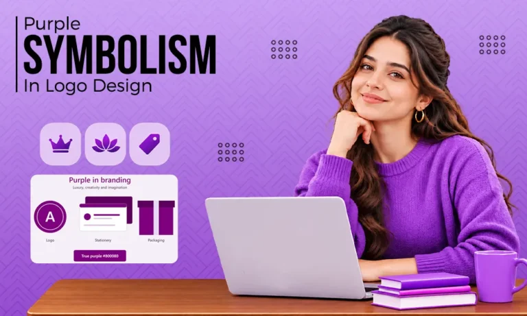
What does purple color mean? It stands for royalty, creativity, wisdom, and spirituality. Born from calm blue and energetic red, purple blends luxury with imagination. Knowing its meaning helps you use it with purpose. Whether you are building a logo or a full brand, this guide covers what purple symbolizes, its spiritual meaning, and why it matters in branding and logo design.
Quick Answer:
The purple color meaning centers on royalty, luxury, creativity, wisdom, and spirituality. In design, light purples feel calm and gentle, while deep purples feel rich and premium. Spiritually, purple is linked to intuition, higher awareness, and transformation.
What Does Purple Color Mean in Design?

Designers see purple as representing a sense of creativity, high-quality products, and the individualistic qualities of a product or company. The color sits exactly at the middle point on the color wheel between blue (calm) and red (energy). This allows designers to create a rich feeling with their designs using the calming elements of blue and the energizing elements of red.
In terms of historical significance, purple has been exclusive. Prior to its widespread availability, purple was one of the most expensive dyes available. Therefore, it had become a status symbol over time.
What Does the Color Purple Symbolize and Represent?
Purple is associated with royalty, luxury, creativity and/or wisdom. These meanings will depend on both the specific tone (lighter or darker) and the context in which they’re used. Here are some examples of what it can represent:
- Royalty and Power: A direct connection to an emperor or crown or ceremony
- Quality and Luxury: Often used to indicate that something has been developed as a premium product and service
- Creativity/Imagination: Associated with the artists and dreamers who create new concepts/original thinking
- Wisdom/Dignity: Deeper tones may also be interpreted as having wisdom/experience/dignity
- Mystery/Magic: Think of fantasy, the night sky/the unknown
A different way to look at this is that while there are many good reasons to choose purple for a project, purple can also be perceived as over-the-top and/or artificial if used excessively. And using an inappropriate purple may have a gloomy, moody effect. Therefore, both of these aspects, i.e., selecting purple itself and selecting the right hue are important considerations when deciding whether to use purple in your design.
In addition, context impacts how colors are interpreted. For example, gold with purple conveys the sense of classic luxury. Bright pink/neon green with purple conveys the sense of young/youthful playfulness. So, consider all colors available in the entire palette when judging the potential formal/fun impact of each.
Meaning of Color Purple in Spirituality
Spiritually, the purple color is considered an intuitive, a higher conscious, transformative color; it’s also recognized as the bridge connecting our physical lives to our spiritual lives.
Purple shows up in many different forms within traditional practices:
- Chakras: The Crown Chakra is represented by both violet and purple colors, while indigo represents the Third Eye Chakra (the ability to see into the future).
- Christianity: During Advent and Lent, purple is utilized to symbolize self-reflection and penance.
- Mindfulness/Meditation: Purple helps create a sense of calmness, focus, and awareness.
Did you know?
Many wellness/meditation/spiritual organizations select purple because they believe it creates a sense of peace while still being reflective.
This makes a difference to designers. If you use either a soft lavender or a deep violet, it will show your audience that your organization is concerned about their well-being and creating a spiritual experience for them… all without ever saying a word.
Importance of Purple Color in Branding and Logo Design
Purple is an important color for branding, as purple sets a brand apart from other colors while at the same time making it look high-end. As many industries are using blue, red, and green to create their identities, purple provides a unique visual distinction.
Here’s why businesses have made this choice:
- Purple conveys value. Purple creates the perception that a product is valuable enough to pay for.
- Purple has a creative flair. Brands that have creative personalities will find that purple fits them well.
- Purple has memorability. Fewer companies use purple than blue, red, etc.; therefore, consumers can better recall the name of a company if they see purple.
Purple also does well with specific types of businesses, such as:
| Industry | Why Purple Works |
| Beauty and skincare | Feels luxurious and caring |
| Wellness and spirituality | Feels calm and reflective |
| Education | Suggests wisdom and growth |
| Tech and creative tools | Feels innovative and imaginative |
| Chocolate and premium food | Feels indulgent and rich |
Well-known examples of brands that use Purple are Cadbury, Twitch, Yahoo, and Hallmark. All four brands have used purple in completely different ways, ranging from classic/rich, modern/bold, and young/fresh to traditional/trusted.
Purple can help you position emotionally as well. Deep purple will tell customers that they are buying from an established brand that has trust built into it. Bright Violet will say that you are new, forward-thinking, and embracing technology. Both are correct depending on who you want to talk to.
The problem with using purple as an everyday default color is that it typically will not work. When creating a logo design, you have to think about how you want your company/personality to be portrayed.
Therefore, a law firm logo in purple would need to be created differently than a gaming brand logo in purple. The shade of purple you decide on is going to set the overall “tone” of your company/brand long before people read your name.
Purple Shades and Their Meanings (With Hex Codes)
Every shade of purple tells a slightly different story. Lighter tones feel soft and calm, while darker tones feel serious and luxurious. Use this table as a quick reference:
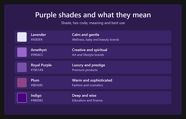
| Shade | Hex Code | Meaning and Best Use |
| Lavender | #E6E6FA | Calm and gentle; wellness, baby, and beauty brands |
| Amethyst | #9966CC | Creative and spiritual; art and lifestyle brands |
| Royal Purple | #7851A9 | Luxury and prestige; premium products |
| Plum | #8E4585 | Warm and sophisticated; fashion and cosmetics |
| Indigo | #4B0082 | Deep and wise education and finance |
Notice the pattern. Lighter purples move toward softness and comfort, while darker purples move toward authority and depth. Pick the one that matches your audience, not just the one that looks good on screen.
How to Use Purple in Your Designs
Use purple with a clear purpose, and keep the rest of your design supportive. Here is how to apply it across different formats.
1. In Logos and Brand Identity
Pick a primary purple, and write down its HEX, RGB & CMYK codes in your style guide. The use of a single color scheme throughout all aspects of your brand (your site, packages, social media) will show consumers that you have taken the time to develop a cohesive brand image.
A complete brand identity design will help to illustrate the above, as well as a light and dark version of each purple used for background colors and hover states. Additionally, consider having a one-color version of your logo for printing purposes and when displaying your logo at very small sizes.
2. In Social Media and UI/UX
Purple works well for buttons, highlights, and backgrounds. On social posts, use a bold purple as a focal point and keep the rest simple. For apps and websites, make sure text on purple has enough contrast to read comfortably.
3. Colors That Pair Well With Purple
These combinations rarely fail:
- White or cream: clean and modern
- Gold or yellow: rich contrast, classic luxury
- Soft grey: calm and professional
- Teal or mint: fresh and creative
Pro Tip: Test your purple in both light and dark backgrounds. A shade that looks rich on white can turn muddy on black.
Need Help Picking Your Brand Colors?
Choosing the right purple is easier with an experienced designer. The team at Pixifyo helps brands select colors that match their audience and goals, from logos to full identities. You work with senior designers, get a 24-48 hour turnaround, and pay nothing in advance.
Conclusion
Purple is associated with royalty, creativity, wisdom, and spirit. The power of purple as a color for designers comes down to finding the right shade of purple that matches the intended message. Be intentional when using purple in your design palette, also use a small number of colors, and test your design on all formats.
Want to create an amazing brand? Sign up now for a free trial at Pixifyo or let us know what purple is your favorite in the comments below.
FAQs
What does the color purple symbolize?
The purple color is symbolic of royalty, luxury, creativity, wisdom, and mystery. Light purple is calming and soft. Dark purple is luxurious and has an authority about it.
What does the color purple represent spiritually?
The purple color is spiritual to intuition, higher consciousness, and transformation. The purple color is related to the Crown Chakra, and Indigo is associated with the Third Eye.
Is Purple Good for Logo Design?
Yes, as long as you can match it with your brand personality. Purple will give your logo a premium and creative look, which will also help you stand apart from brands that use other common colors.
Why is Purple Associated with Royalty?
Historically, Purple Dye was very hard to make and was therefore very expensive. Therefore, Only Rulers and Wealthy people wore purple clothing. This History made the purple color royal.