

Brand logos play a crucial role in marketing. But they don’t build overnight. Companies build cool logos with a combination of meaningful design, clean typography, color palettes, and credibility.
Whether you are a new business owner looking for rebranding or someone who explores cool logo designs, this article is for you. Here, you can discover the top 16 best logo examples and their hidden meanings.
Let’s go ahead!
Best Logo Examples With Their Meanings
Many intelligent designers create cool logos that help brands achieve visibility. The best logo examples include:
- Nike
- Apple
- Chanel
- McDonald’s
- Shell
- FedEx
- Pepsi
- Ferrari
- Airbnb
- World Wildlife Fund
- Patagonia
- Disney+
- Amazon
- NBC
- BMW
- Vaio
If you want to get inspiration for your new business, you can look at these logo ideas. Here, you will understand them and their hidden meanings.
1. Nike
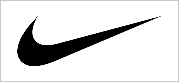
Nike is one of the perfect examples of cool logos. A graphic design student, Carolyn Davidson, created the Nike Swoosh in 1971 for just $35.
When it comes to design, the checkmark is simple, elegant, and easy to recognize. It symbolizes speed and movement that fit the company’s products. Davidson crafted the logo to resemble the wing of the Greek goddess of victory.
After years of branding and marketing, the logo has become popular across the world. The brand has also built a good image by supporting athletes in reaching their potential.
2. Apple
Who doesn’t know Apple? Well, an apple with a small bite on the right side makes it the new symbol of technology. Rob Janoff designed the Apple logo in 1977 after replacing “Sir Isaac Newton sits under the tree.”
He intentionally designed a small bite in the logo to differentiate an apple from a cherry. This unique and simple logo design is easily recognizable and prints on smaller computer parts.
First, the Apple logo was covered with rainbow stripes to symbolize the first color home computer. Later, it was redesigned in all black, and now it changes to match metallic displays.
Pixifyo Tip:
Sometimes logo designs require redesigning to reflect new business goals, follow trends, and meet digital needs.
3. Chanel
Chanel’s logo, “interlocking Cs,” represents its founder’s name, “Coco Chanel.” In 1925, she designed the logo herself in black to represent a bold personality.
At first, the color black was considered inappropriate for the fashion industry. But she introduced the black color to the bold fashion statement in Paris.
Now, the black and white logo is synonymous with a clean and bold logo. It has become so powerful and iconic that people with expensive taste easily recognize the Chanel brand.
4. McDonald’s
McDonald’s is also counted among the best logo ideas. The golden arches, that looks like the letter “M” with a red background, also make the brand valuable worldwide.
Jim Schindler designed the logo in 1962 to symbolize the two yellow arches of the old McDonald’s restaurant. Now, this aesthetic symbol is used on packaging, uniforms, billboards, and other operations of the company.
The red logo background also makes it super catchy and attractive. It grabs people’s attention from far away.
5. Shell
The Shell logo is the oldest among 22,000+ trademarks owned by the Shell company. It hires recognized artists to design a logo rather than illustrators for marketing.
In 1992, the seashell called “Pecten” was designed with warm yellow and red colors. It gives a soft touch and broader visual appeal. These colors also make it stand out from its competitors. This indicates that the Shell logo plays a vital role in the company’s branding and success.
6. FedEx
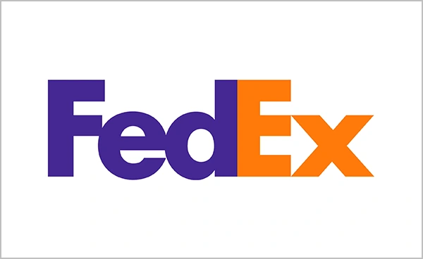
FedEx is renowned for its famous hidden arrow. If you notice the white space between the letters “E” and “X,” you can recognize an arrow. It makes it a cool and genius move that uses negative space.
Lindon Leader created this design in 1994, and the logo won various awards. It represents moving from point A to point B with speed and precision. This helps the brand be easily recognizable to people.
7. Pepsi
Arnell Group designed the Pepsi logo for $1 million in 2008. But in 2009, the logo design footprint PDF was leaked, revealing the design connections.
Despite the controversy, the red, white, and blue balance is attractive and gains customers’ attention. It symbolizes the joy of laughter, indicating that Pepsi products make people happy.
Also, the globe shape resembles different communities and people from all over the world.
Fun Fact:
Many people still wonder how Pepsi’s latest logo is worth $1 million.
8. Ferrari
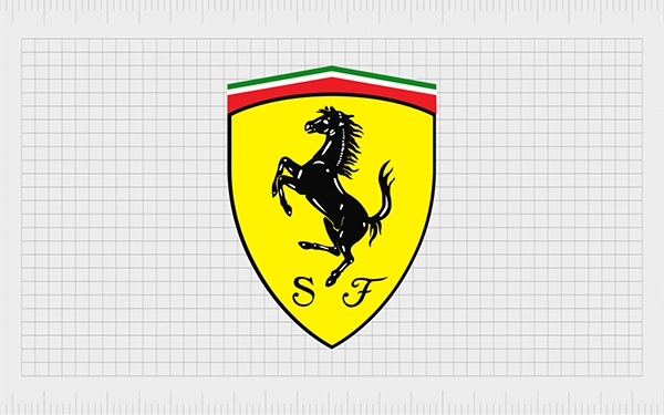
The yellow painted prancing horse was used by an Italian World War I pilot as a symbol of pride. Later, Ferrari adapted this symbol as its brand logo for racing cars.
The creativity of this logo represents various things, such as:
- The yellow shield indicates the city of Modena, the hometown of Ferrari’s founder, Enzo Ferrari.
- Green, white, and red stripes show its Italian roots.
- The letters “S” and “F” stand for “Scuderia Ferrari,” which means “Ferrari Team.”
Did You Know?
Ferrari banned Justin Bieber due to reckless driving at night. The company set strict brand protection policy rules to maintain an exclusive image.
Also Read: What are the Different Banner Sizes? Standard Dimensions and Their Uses
9. Airbnb
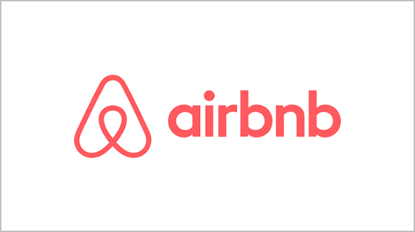
Airbnb logo was redesigned by the DesignStudio agency in 2014. The symbol is one of the best logo examples, as it represents various meanings. When you break down the logo design into parts, you can see:
- A head of a person represents people who share experiences.
- A pin of a location symbolizes that Airbnb hotels are available for travelers.
- An inverted heart shows love and belonging.
- The letter “A” automatically indicates “Airbnb.”
Although the company faces backlash for its design, it never changes its brand logo. This means that if you are confident about your cool logo, don’t let anyone demean you.
10. Starbucks
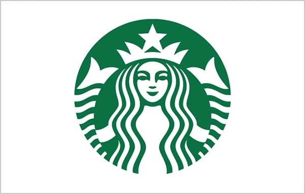
Starbucks has gained immense popularity in the coffee industry. The twin-tailed siren, one of the coolest logos, also helps the brand to reach success.
Terry Heckler designed the original iconic two-tailed siren in 1971 based on the 16th-century Norse woodcut. In 2011, the company decided to make it simple and uncluttered.
The in-house team removed the Starbucks name from the logo and replaced brown with black. This made it more attractive and recognizable.
11. World Wildlife Fund

World Wildlife Fund is a Swiss-based organization that preserves wildlife and the environment. The brand logo includes a black-and-white panda that represents the protection of endangered species.
This logo also has a rich history. In 1958, a great panda named “Chi-Chi” arrived at the zoo in London. She instantly became the main character of the zoo and attracted every visitor. After that, she became the inspiration for this logo design.
The animal’s black and white fur makes a clear contrast and grabs everyone’s attention immediately.
12. Patagonia
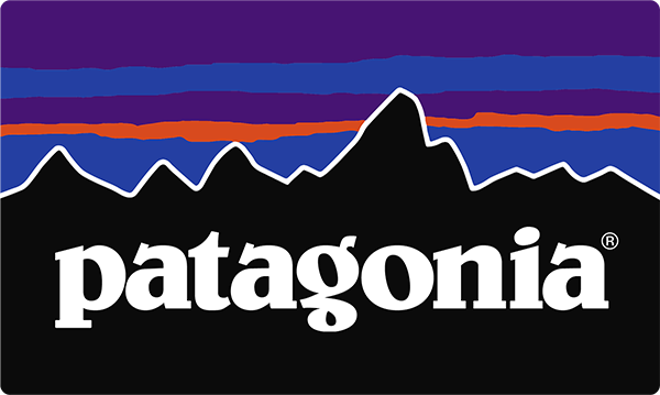
Patagonia is known for its clothing and gear for activities like climbing, surfing, skiing, etc. Freelance artist Jocelyn Slack designed the company’s logo in 1975.
It is one of the best logo examples for inspiration. The logo design includes a mountain shape that represents “Mount Fitz Roy,” located in Patagonia. This creative logo easily indicates that the company designs outdoor clothing.
The right colors and clear typography make it easily understandable and identifiable.
13. Disney+
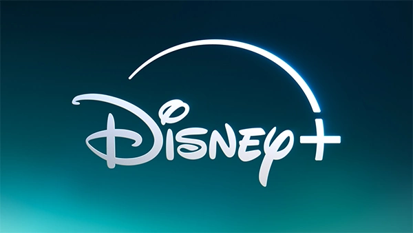
Disney remains famous among children and has become a household name across the world. But it has also crafted one of the cool logos that attracts a wider audience.
When you look at the brand logo, you can figure out that “Disney” is in a handwritten style. It is the signature of the founder, “Walt Disney.” At present, the logo has transitioned into 3D graphics with a “+” sign to feature “Disney+.”
After upgrading to the founder’s handwriting, the company doubts whether this generation recognizes it. But the brand design process eventually becomes one of the best logo ideas.
14. Amazon
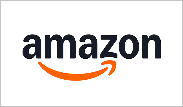
Amazon’s logo, in clear black and white with a yellow smile-like arrow, is easy to recognize. It was created by the design agency Turner Duckworth in 2000 for rebranding.
The logo includes a hidden meaning. When the arrow starts from the letter “a” to “z,” it indicates that the company sells everything. This directly tells people about the e-commerce platform.
Also, the smile shows that the customers are really happy with the Amazon products.
15. NBC
NBC’s current logo is listed in the “cool logos.” Steff Geissbühler, the designer, created the logo in 1986 with six colors.
When you look at the six colors, you recognize it is a peacock. But why the peacock? It is based on the common phrase “proud as a peacock.” This way, the company promotes its new color system.
Also, the six different colors represents it various departments, such as news, sports, entertainment, television stations, networks, and production. It means that the brand doesn’t need different logo ideas or designs for other corporate divisions.
16. BMW
The BMW logo was created in 1917, when the company changed its name to Bayerische Motoren Werke. It includes the blue and white colors to represent the Bavarian flag.
But these colors are inverted because local trademark laws forbade the use of official symbols at that time. The combination of blue and white with BMW letters makes it really attractive and visually appealing.
There is also a myth that the circular shape of the logo represents a spinning airplane propeller. But the official BMW sources clarify that it’s only an urban myth.
17. Vaio
Sony Vaio is known for its technology, and its logo reflects that. Japanese product designer Teiyu Goto created the brand logos in 1996. The letters “V” and “A” symbolize the analog sine wave.
Meanwhile, the letters “I” and “O” represent the binary digits 1 and 0. The company uses this logo idea to promote its business goals and highlight computer-based technology.
Common Key Factors to Create Cool Logos
Alongside types of logos, you should also focus on simplicity, uniqueness with hidden meanings, originality, and color psychology.
Let’s take a look at common key factors to make your brand logo.
1. Simple
A simple logo is easy to understand and recognizable. Nike and Apple’s logo designs are the best logo examples to add value and credibility without complexity. They are also easy to print on different platforms and products.
2. Unique with Hidden Meanings
FedEx’s arrow, NBC’s peacock, and McDonald’s golden arches have unique logos with hidden meanings. These logos represent their business goals and the story behind the designs. That is why unique logos stick in people’s minds.
3. Color Psychology
The right color combination also plays with customers’ minds. It conveys emotions and connections. Like the World Wildlife Fund’s panda symbolizes a real animal, BMW uses blue and white to indicate the Bavarian flag.
4. Original
“An original is worth more than a copy.” Your logo design should be more original and unique than your competitors’. It prevents you from legal disputes and confusion. You can also easily give your brand a unique identity.
Also Read: Types of Printing: Methods, Meaning, and How to Choose the Right One
Wrapping Up!
These cool logos inspire you to design another unique logo for your brand. The one thing about branding is consistency. You have to add credibility, trust, and business goals to your brand logo.
If you’re not sure about where to start, you can also go for the Pixifyo logo design service. Their professional designers align with market research and business goals. They can also offer eye-catching, original, and unique logo designs.
Frequently Asked Questions
What is the coolest logo?
FedEx is considered the coolest logo because the letters “E” and “X” have a hidden arrow. The designer smartly uses the negative space to show the brand goals.
What are some great logos?
Examples of some great logos are the following:
- Nike
- Apple
- McDonald’s
- Amazon
- Disney+
How to create a unique logo?
You can create a unique logo with a combination of the right colors, typography, brand goals, and original design.
What are luxury brand logos?
Chanel and Ferrari are luxury brand logos create timeless designs that make their brands easily recognizable around the world.