Apple, Google, Nike, Mercedes-Benz, FedEx, Samsung, and Amazon are some of the most famous brand logos, known for their iconic designs, evolved over decades, their lasting impact, and their psychological connection with their customers. According to Nielsen data, a recognizable brand logo delivers a 15% boost in brand recognition, showing how visual symbols help consumers identify and remember a brand.
What makes a brand logo famous is its simplicity, memorability, and modern appeal so that it registers instantly in human memory. Famous brand logos evolve, and to learn more about their logos, stories, history, evolution, and interesting facts, read on.
Most Iconic and Famous Brand Logos With Their Unique Story and Evolution
Apple, Google, Samsung, Nike, Amazon, Mercedes-Benz, FedEx, Starbucks, Coca-Cola, McDonald’s, and more are some of the most famous brand logos, known for their simplicity, modern designs, and recognizable patterns.
1. Apple
Apple’s logo is one of the most famous brand logos, known for its simple, sleek silhouette of an apple with a bite taken out of its right side, considered important to distinguish an apple from a cherry. The minimalist design reflects the brand’s focus on simplicity, innovation, technology, and premium design. The simplicity makes it easily recognisable and easy to reproduce across all devices, technologies, and packaging.
Apple’s Story of History and Evolution:
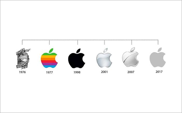
Apple’s first logo was designed by Ronald Wayne in 1976, showcasing an elaborate picture of Issac Newton sitting beneath an apple tree.
However, because of its elaborate design and difficulty in mass production, Rob Janoff created a rainbow-striped apple in 1977.
Over the years, the logo underwent different changes, including rainbow stripes, monochrome versions, and metallic finishes, but retained the basic silhouette of a bitten apple.
Interesting Facts and Theories About Apple:
Some research and theories claim that the “bite” in the apple is a symbol of “byte.”
According to some theories, the Apple logo could be a tribute to Alan Turing, the father of modern computing, who died after eating a poisonous apple.
*These are theories and discussions rather than established facts and official inspirations.
2. Google
Google’s logo is instantly recognizable with the simple “Google” wordmark and four primary colours: Red, Green, Blue, and Yellow. The sans-serif font reflects brand flexibility, cohesiveness, and a user-friendly nature; multiple colours add a playful element and energetic personality. Currently, Google uses Doodles to mark anniversaries, events, and celebrate unsung heroes.
Google’s History and Evolution:
Google initially started as a search engine project named Backrub. However, it was scrapped, and the business name was changed to Google.
The first official Google logo was designed using a free graphics program with retro WordArt.
In 1999, Ruth Kedar created a colourful Google logo with a new typeface, Catull, which became its signature identity.
Over time, it moved from shadows, 3D effects, and exclamation marks to a simple, flatter look. In 2015, it created a custom geometric sans-serif, Product Sans, for a modern look and easy readability.
Interesting Facts About Google:
Earlier, Google was supposed to be named Googol, but it was accidentally misspelt and found to be more appealing. Hence, this name was adopted.
The use of three primary colours (Red, Blue, and Yellow) was decided earlier; however, a secondary colour (Green) was added to show that Google does not follow rules.
3. Coca-Cola
The Coca-Cola logo is known for its Spencerian script, a popular flowing cursive script used by American bookkeepers in the 19th century, and its iconic red-and-white colour combination. The handwritten script adds personality and tradition and serves as a symbol of classic Americana, while the red colour adds energy, visibility, excitement, and nostalgia.
Coca-Cola’s Story and Evolution:
In 1887, Frank M. Robinson created the Spencerian wordmark script for Coca-Cola.
It underwent small changes till 1941, when the script was refined to the modern red-and-white form.
In 1969, the white Dynamic Ribbon was introduced.
From 1987 to 2007, the colours and ribbon were refreshed for a modern and simple look.
Currently, it’s known for its classic script and ribbon style.
Interesting Facts About Coca-Cola:
Coca-Cola’s famous bottle was called the “contour bottle,” which could be recognised by touch in the dark and even when it’s broken.
Invented in 1886 by Dr John Stith Pemberton, Coca-Cola was earlier used as a medicinal drink to treat fatigue and headaches, usually sold at a pharmacy for 5 cents.
4. McDonald’s
McDonald’s is known for its golden arches, which form a bold “M”, symbolizing brand identity, visibility, warmth, and accessible dining options. Designed by Jim Schindler in 1962, the design was inspired by the yellow architectural arches designed into roadside restaurants in the 1950s. Its bright yellow colour adds an energetic vibe, evoking nostalgia and a friendly vibe.
Story and Evolution of McDonald’s:
Starting from a drive-in barbecue chain to launching a speede hamburger stand, McDonald’s became a fast food model in 1953.
In 1962, Jim Schindler turned the arches into the Golden Arches logo.
The arches later became a clear “M” in 1975.
It later became more simplified than previous versions.
Interesting Facts About McDonald’s:
McDonald’s logo has several interpretations. For some people, the two arches represent the two brothers who founded the restaurant. Others believe that its golden colour represents warmth and stability.
Another popular interpretation is that its yellow arches represent the thin, long fries that the brand is famous for.
5. Nike
Nike, one of the most popular brand logos, also called the Swoosh, designed by Carolyn Davidson in 1971, is a curved tick mark representing speed, motion, and movement, which is what the brand stands for. Inspired by the wing of Nike, the Greek goddess of victory, it symbolises ambition, the desire for victory, innovation, and athletic movement.
The Story of Nike:
Started as Blue Ribbon Sports in 1964 by Phil Knight and Bill Bowerman, the brand was renamed “Nike” and introduced the Swoosh sign in 1971.
Later, from 1978 to 1985, the Swoosh appeared along with the wordmark. It appeared in various colours, adapting to the products.
In 1995, the standalone Swoosh was adopted, moving towards image-centric branding and establishing a psychological connection.
Interesting Facts and Theories About Nike:
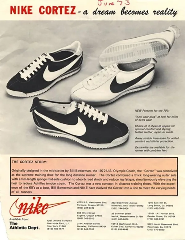
The first Nike shoes with the Swoosh symbol were called “Nike Cortez”, launched in 1972.
The famous Waffle Trainer, launched in 1974, was inspired by a waffle iron used by Bill Bowerman, the co-founder’s wife.
6. Amazon
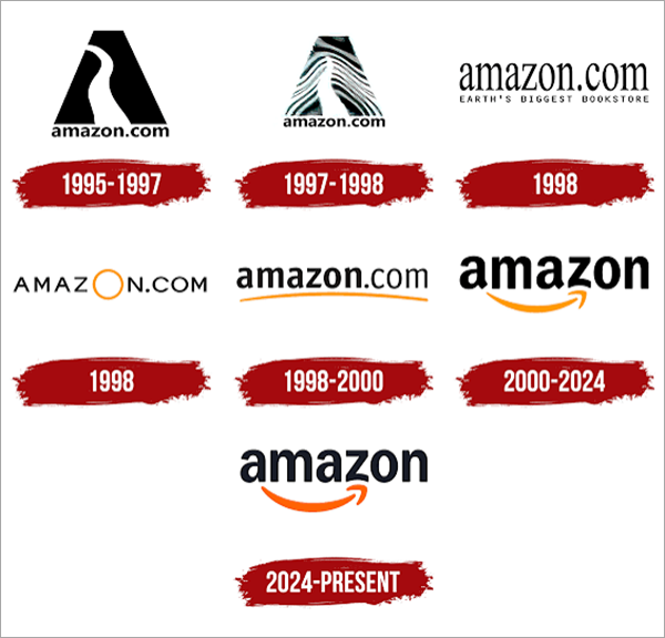
Amazon is among the well-known brand logos, recognised globally for its iconic Smile logo, introduced in 2000, which features an orange curved arrow running from “a” to “z”. It shows two brand aspects: first, the customer’s happiness with the shopping experience at Amazon (smile) and the wide range of products (arrow running from A to Z). Hence, it represents the brand identity: a one-stop shop for all shopping needs.
The Story of Amazon: History and Evolution
Started as an online bookstore, Amazon’s first brand logo was launched in 1995 and featured a stylized “A” with a river flowing through it (inspired by the Amazon River).
From 1997 to the 2000s, it experimented with several minimalist logos as the brand expanded beyond books.
Finally, in 2000, it launched the iconic Smile Logo that symbolized customer satisfaction and a broad range of products.
The Mercedes-Benz logo, launched in 1909, is known for two key elements: the three-pointed star, which represents the company’s ambition of universal motorization. The points represent land, sea, and air — environments the company believed it would one day dominate with Mercedes-Benz engines. It reflects the brand’s identity of luxury, engineering, innovation, and prestige.
The Story of History And Evolution of Mercedes-Benz:
Daimler-Motoren-Gesellschaft (DMG) introduced the three-pointed star as a trademark in 1909; earlier, this was just a wordmark “Mercedes”.
The star was placed within the circular design in 1916; however, after the brand’s merger with Benz, it was combined with Benz’s laurel wreath in 1925.
In 1926, it was refined to create a familiar combined logo, and now the encircled three-pointed star is the symbol of Mercedes-Benz.
Interesting Theory About Mercedes-Benz:
Some legends and theories state that the three-pointed star logo was inspired by Gottlieb Daimler’s postcards to his son in 1872, where the star symbol was used to mark his family home.
8. FedEx
Earlier known by its full name, Federal Express, the logo and the brand FedEx was launched in 1991. Known for its negative-space design, the logo uses the FedEx wordmark in purple and orange, with a hidden arrow between “E” and “x”, symbolising speed, movement, and direction, the features associated with FedEx’s delivery business.
History and Evolution of FedEx: How Federal Express Became FedEx
Founded in 1971 by Frederick W. Smith, FedEx began operating under the name Federal Express from 1971 to 1993.
In 1994, when Federal Express launched its website with online package tracking, it shortened its name to “FedEx”, known for its clever and professional design, with hidden secret cues.
The new logo was designed by Lindon Leader, famous for designing iconic brand logos, such as Disney, Motorola, Addison, and more. FedEx’s new logo dropped the blue and red for the new purple and orange colour.
The current logo of Samsung is known for its simple wordmark design that creates a modern, clean, and globally recognised brand name and identity. Based in South Korea, the company was founded by Lee Byung-Chull in 1938 as a grocery trading store. The name “Samsung” translates to three stars in Korean, reflecting the brand’s vision of being large, strong, bright, and everlasting. This three-star symbol appeared in Samsung logos until 1993.
The Story of History and Evolution of Samsung:
Founded as a grocery trading store in 1938, Samsung Electronics was established later in 1969.
From 1938 to around 1979, the Samsung logo featured the three-star symbol.
However, in 1993, Samsung emerged with a new corporate identity and brand logo with a blue oval surrounding the white Samsung wordmark.
2005 brought the major Samsung logo, which removed the blue oval, leaving the signature Samsung wordmark in blue colour used currently.
10. Starbucks
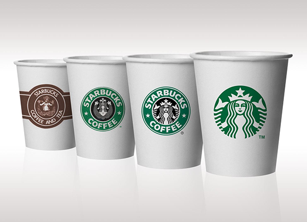
Starbucks is among the well-known brand logos, recognised for its iconic siren logo that features a mythological figure, inspired by the brand’s origins in Seattle and its seafaring roots. Famous for their coffee, pastries, teas, lattes, and light bites, Starbucks’s siren sign is used to represent the irresistible appeal of their coffee, marked against the green background, which creates a welcoming vibe for the customers.
The Starbucks’ Story of History and Evolution:
The brand had humble beginnings in 1971 with the name Pequod, which was later changed to Starbucks Coffee, Tea, and Spices with a brown logo featuring the siren.
In 1987, Howard Schultz changed the logo to green after the company became an official coffeehouse and dropped the tea and spices from its name.
However, the design was simplified in 1992 with a greater emphasis on the siren face and later, the name “Starbucks” was dropped from the logo when the siren face became a standalone symbol.
Interesting Facts About Starbucks Logo:
Starbucks was earlier called Pequod, named after the whaling ship in the story of Moby Dick. However, it was not catchy enough, so Starbucks was chosen, inspired by the name of the ship’s chief mate.
The siren figure is a mythical Greek creature, known for alluring sailors. Now, it stands as a symbol of Starbucks to allure the customers for their iconic coffee.
What Makes Popular Brand Logos Iconic?
Simplicity and distinctiveness in logo design make popular brand logos iconic. They are meaningful, memorable, and timeless, establishing an emotional connection with the customers.
Here’s what makes popular brand logos iconic:
Simplicity: Easy to remember, recognise, and pronounce.
Distinctive: Unique colours and patterns that stand apart from the competitors.
Meaningful: A brand logo that reflects its vision, ambition, identity, values, and services.
Memorable: Creates a visual impact on human memory.
Timeless: A logo that remains recognisable even when trends change.
Final Thoughts
Brand logos are not just symbols, but they stand for a brand’s identity, ambition, and vision. What makes a brand logo famous is its simplicity, modern appeal, differentiation, and emotional connection with its customers.
From Nike’s Swoosh to Amazon’s happy smile, these are the world’s most memorable logos, which not only communicate a brand’s identity but are also easily recognisable, leaving a lasting impact on human memory.
Frequently Asked Questions (FAQs)
What are the most iconic and famous brand logos?
Apple, Google, Nike, McDonald’s, Coca-Cola, Pepsi, Amazon, and LG are among the most recognizable brand logos worldwide.
What makes a brand logo famous and memorable?
The simplicity, distinctive design, colours, and easy-to-remember features make a brand logo memorable and easily identifiable.
Why do brands use specific colours in their logos?
Colours are known to influence how people remember and perceive a brand. It communicates brand identity, personality, and positioning. For example, the colour red conveys energy and excitement, while black and white are generally associated with luxury and sophistication.
Which famous brand logos have hidden meanings?
Baskin-Robbins, Amazon, FedEx, and Toyota are some famous brand logos that have visual elements with additional meanings.